Why are we drawn to one book cover over another?
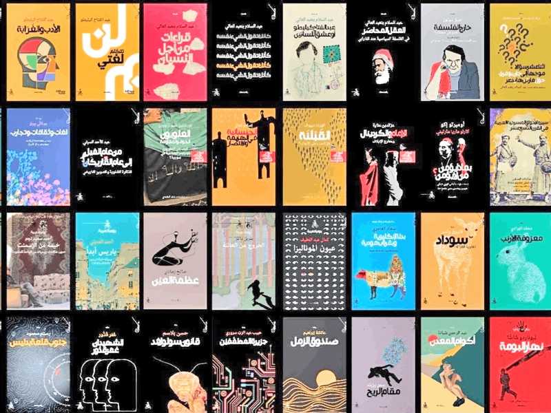
Ehab Al-Jawarneh: Some may believe that a book cover is merely an artistic frame surrounding the text, but in the publishing industry, it performs a more complex function. Before a reader even reads the title or the introduction, they interact with the book as a visual image; a color, a shape, a font, a composition, an image, and a trademark for the publisher. Within a few seconds, initial impressions are formed that may influence their decision to stop at the book or bypass it. Consequently, cover design has become a field where graphic design intersects with cognitive psychology, consumer behavior, and the publishing industry.
When a reader sees a cover, they do not read all its elements in sequence, but rather quickly capture a set of visual cues. Colors, title size, author name placement, the main image, and white space all work together to create an “initial impression.” Research in cognitive psychology shows that humans tend to organize visual elements according to patterns that help them understand the image quickly. Therefore, a well-designed cover does not rely on an abundance of elements, but on the clarity of the visual hierarchy: What do you see first? The title? The author’s name? The image? And which element guides your eye next? Why are we drawn to one cover over another?
Color is one of the most powerful design elements in shaping the first impression. However, the relationship between color and emotion is not fixed; it is influenced by context, culture, and individual experiences. Nevertheless, the publishing industry uses colors in ways that help readers identify the nature of the book. Dark colors and high-contrast compositions are often used in crime and thriller literature, while softer colors appear in certain types of romantic or sentimental literature. The key point here is that the cover does not explicitly tell the reader, “This is a mystery novel,” but rather provides a set of cues that lead the reader to anticipate the type of experience awaiting them.
Typography is not merely writing; even the title of a novel can change its visual meaning depending on the font used. Classic-type fonts can give the book a historical or literary feel, while modern fonts provide a completely different sensation. Furthermore, the size, weight, and placement of the title determine its level of importance within the cover. Thus, a cover designer does not choose a font simply because it is “beautiful,” but because it serves the book’s identity and its target audience.
The image that does not tell the story is one of the most intriguing approaches. Some covers do not present a direct scene from the novel. The designer may use a symbol, a small detail, or an ambiguous image instead of literally depicting the story’s events. The goal is to create a gap between what the reader sees and what they know, as this gap generates curiosity. This makes the cover a kind of visual translation of the literary work.
The Cover and the Human Mind: There is a more important point: the reader does not interact with the cover merely as information, but builds expectations from it. If the cover design suggests a police procedural, the reader will enter the pages expecting mystery and investigation. If the cover suggests a romance novel, the reader may seek a different kind of experience. Here, the importance of what psychology calls “prior expectations” emerges; we do not read the text in isolation from the ideas we bring before reading.
When the Cover Becomes a Trademark: Some books do not even require the author’s name to be read for the reader to recognize their identity. A sequence of colors, a consistent way of writing the title, or a repeated visual style can transform into a distinctive trademark for the author, the series, or the publishing house. At this point, the cover is no longer just a means of introducing the book, but becomes part of the commercial identity of the literary work.